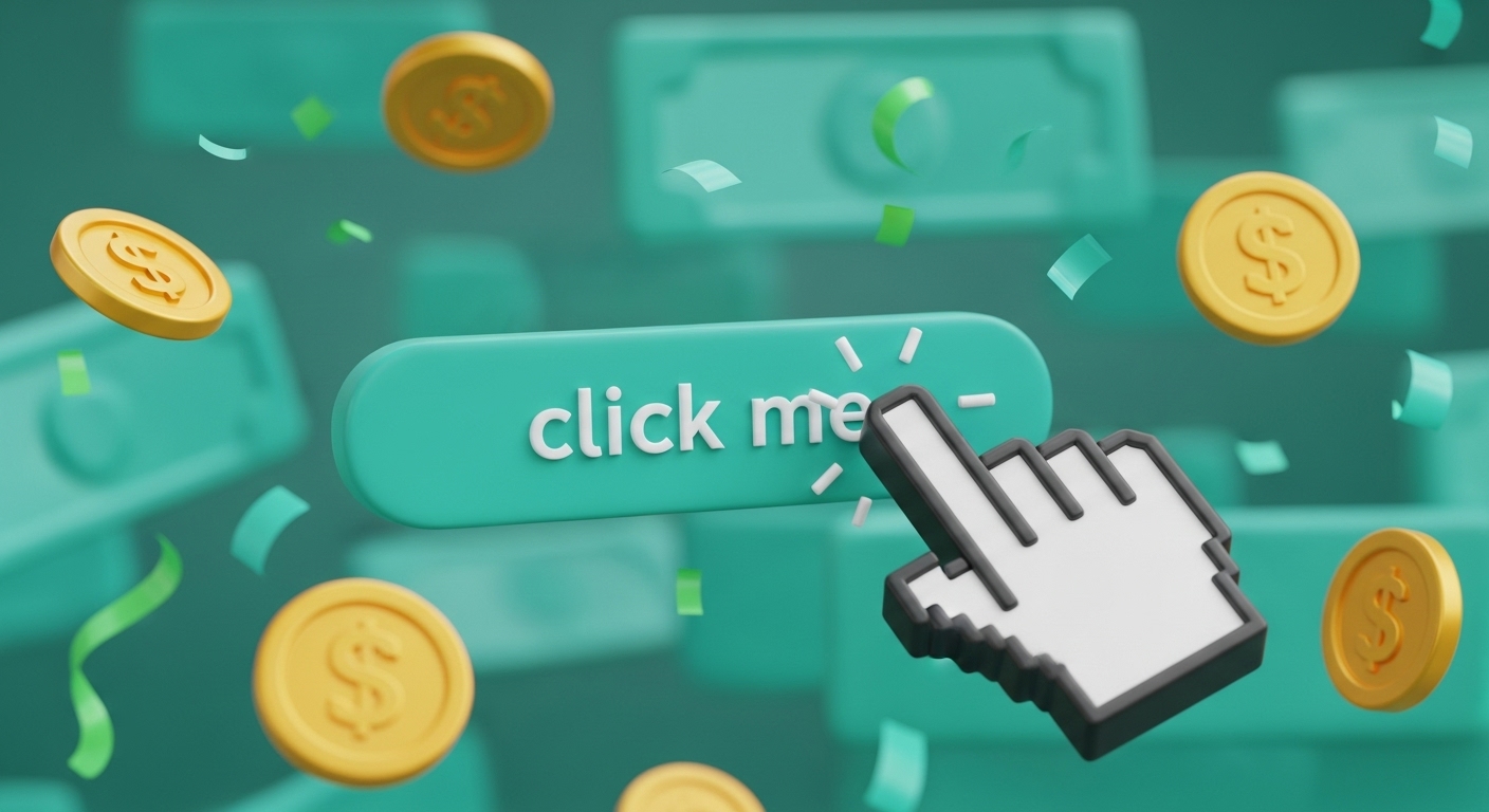
In today’s noisy digital world, attention is currency. Whether you’re a solopreneur selling a service, a brand launching a product, or an agency building campaigns, one thing makes all the difference: your thumbnail.
It’s not just an image—it’s your pitch, your storefront, and your first impression rolled into one. And if it doesn’t stop the scroll, it’s game over.
Why Thumbnails Matter
Your thumbnail is a strategic asset, not decoration. It directly affects your Click-Through Rate (CTR), which algorithms watch closely:
- High CTR? You get boosted.
- Low CTR? You disappear.
Whether it’s a YouTube video, an ad, a Fiverr gig, or a product on Shopify—if the thumbnail doesn’t work, nothing else matters.
Make it Click-Worthy: 5 Essentials
1. Keep It Simple
Sharp visuals, one clear message. No clutter. Less noise = more clicks.
2. Use Strategic Whitespace
Whitespace adds clarity, focus, and premium feel. It guides the eye and avoids overwhelm.
3. Build Visual Consistency
Use the same colors, fonts, and style across your content. Consistency builds trust—especially for repeat exposure.
4. Leverage Color & Contrast
Color triggers emotion. Contrast ensures readability. Both are key. If it can’t be read, it can’t be clicked.
5. Guide the Eye
Create hierarchy. Use size, proximity, and alignment to lead attention exactly where you want it.
Bonus: Trigger Emotion
- Faces create connection.
- Curiosity gaps spark clicks.
- Urgent benefits like “Only 2 Left” or “Delivered in 24h” prompt action.
Test, Don’t Guess
Even great design needs data. A/B test different thumbnails. The best performer might not be the prettiest—it’ll be the one that works.
This isn’t about “selling harder.” It’s about designing smarter. Make them pause, make them feel, make them click.